
Explained by Olly
Explained by Olly
Founder
Founder
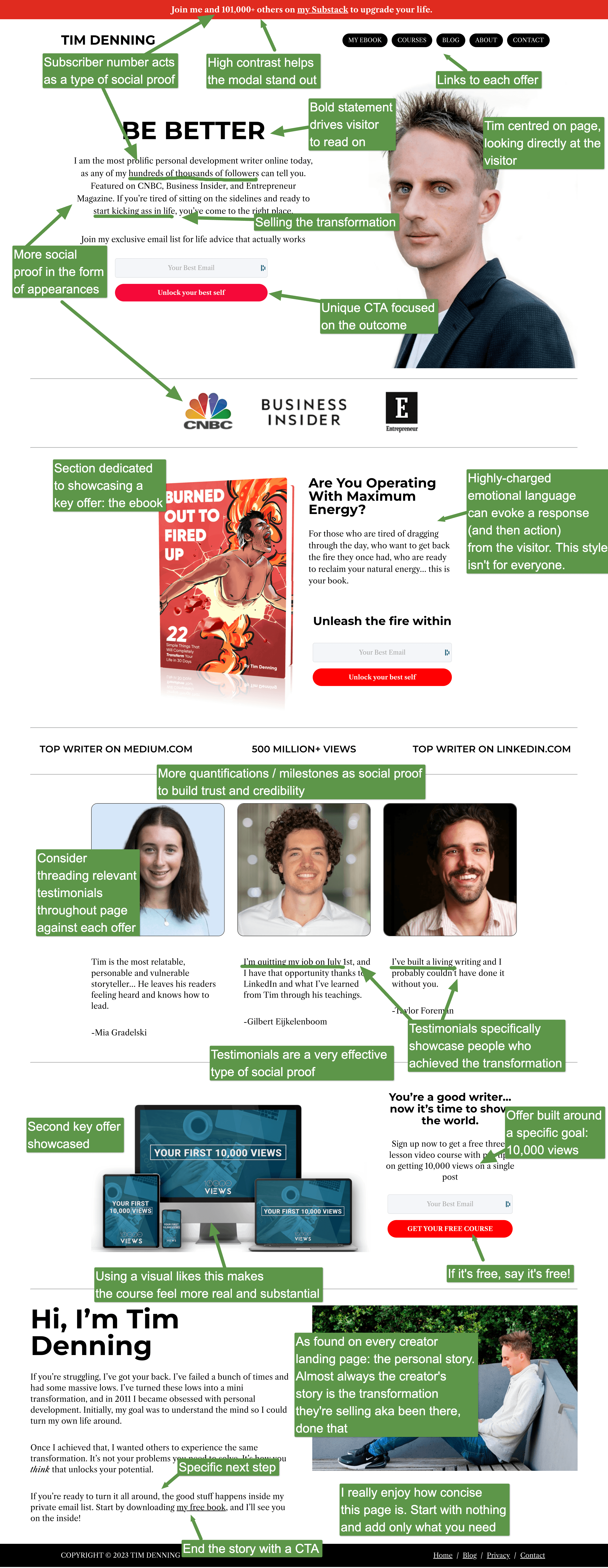
Tim Denning's landing page is focused on transformation. From a boring life, to living life fully, with Tim's courses, newsletter and ebook.
One thing that is interesting on this page is the use of highly-charged emotional language. The aim here is to get the visitor to feel the frustration of not living life fully, so they go on to act. This style isn't for everyone, but is a common and effective copywriting technique.
Long landing pages are harder to update and manage, which is why I tend to recommend starting with nothing and then adding each section with intention.
Tim's page hits the right notes without going overboard: who he is, what he's selling and in what form, and who it's for. This is supported by social proof and transformation-based CTAs.
My tip for improvement? Consider adding relevant testimonials throughout the page to support the key offers: newsletter testimonials for the newsletter, ebook testimonials for the ebook, and course testimonials for the course. This would ensure all the offers are equally supported.
More Landing Pages Explained


