
Explained by Olly
Explained by Olly
Founder
Founder
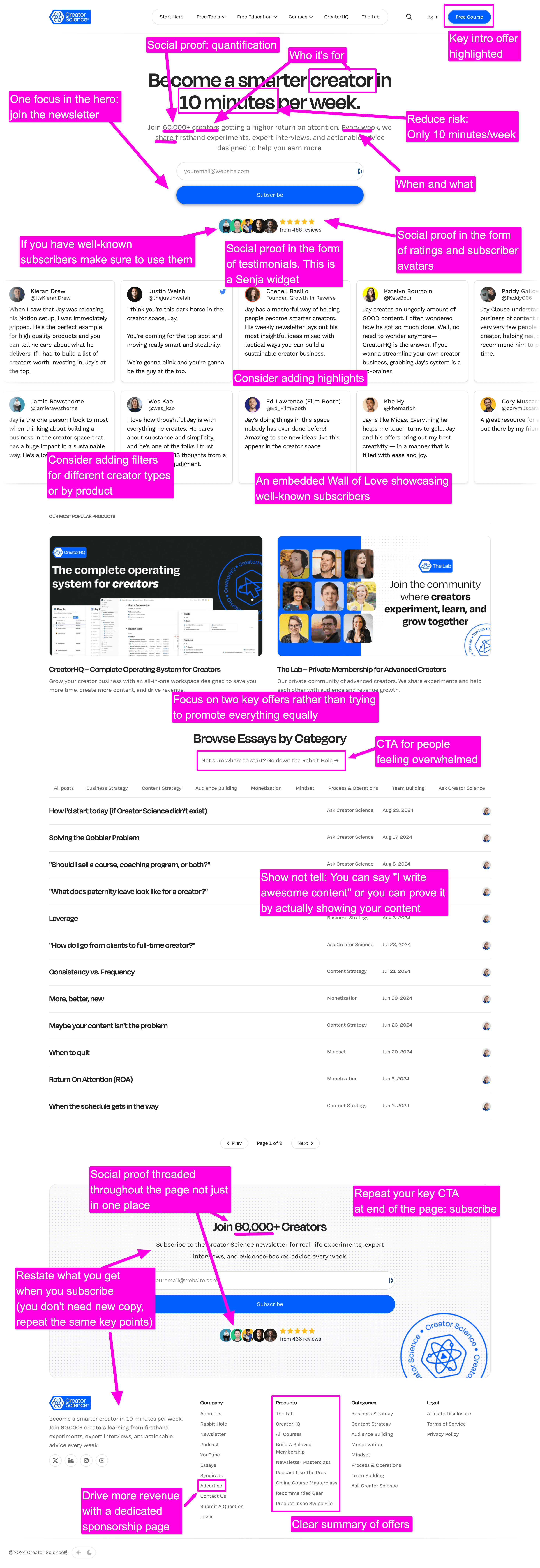
Jay Clouse is a creator educator: he teaches creators how to create better content, build an audience, run their businesses and generate more revenue. So when it comes to landing pages, Jay knows what he's doing.
There's lots of love about his Creator Science page.
First is the simplicity: Jay has been very intentional about what he promotes and where. The key offer is his newsletter, like most creators.
But Jay has also highlighted two more offers: his CreatorHQ product and his The Lab community. This is more effective than presenting every offer equally. Prioritise the logical first offer (newsletter) and then sequence the rest.
I like the use of social proof. Jay uses text and video testimonials throughout his page which is the right way to do it. You want to support your claims, build trust, and centre your happy customers on your page. Adding a single testimonial mid-way through your page isn't going to be as effective.
Interestingly, unlike most creator landing pages Jay doesn't share his own personal story: the page is by Creator Science and written in first person plural ("we" not "I").
I normally suggest (and it's much more common) for creators to write personally on their page. The idea is to build a connection to the visitor, so talking to them as human not a brand is important.
However, I've never tested this.
Either way there's lots to love about this page - great work Jay.
More Landing Pages Explained
