
Explained by Olly
Explained by Olly
Founder
Founder
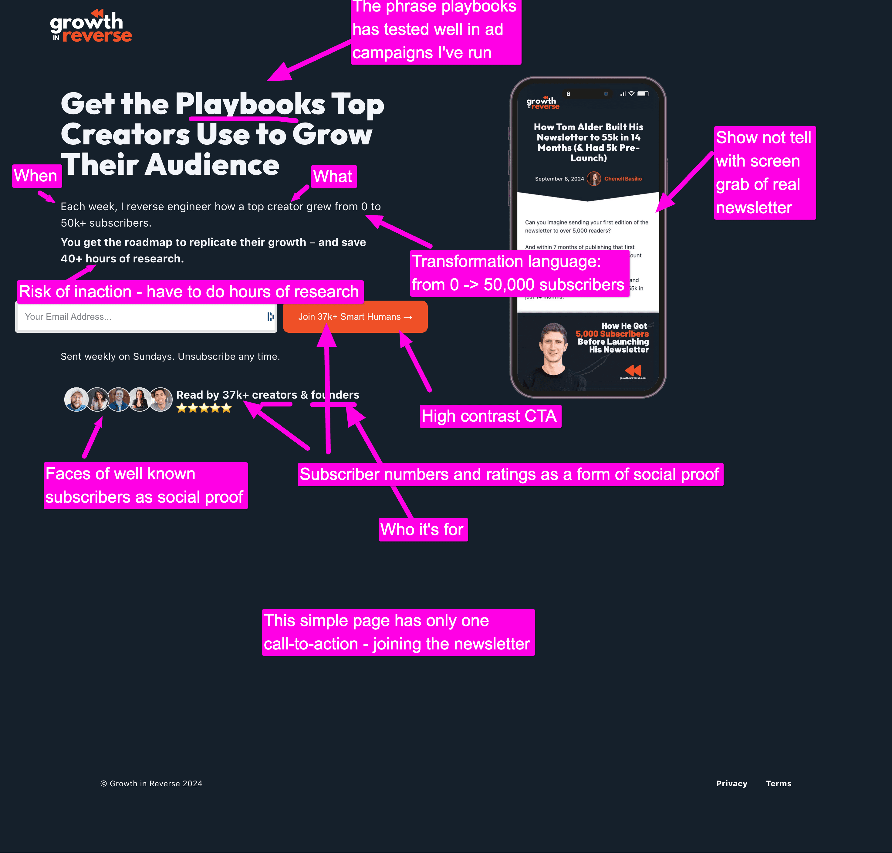
I love Kevon's simple landing page. Simplicity is always a good thing when creating a page. Start with nothing, and add only what the visitor needs to know and do next.
Not only is the page visually simple, but the language is simple too. Avoid complex or stylish phrasing and use plain language for increased scan-ability and less cognitive load.
The page is also written in the first person, for a more personal feel - Kevon is talking directly to the visitor.
As well as that, the photos on the page help create a more personal feeling.
There's a large wall of social proof on the page, with certain testimonials highlighted. But it would be good to see proof across the page and in the Hero (the first section) to drive credibility in context. The addition of filters to the testimonials wallwould be good too - so visitors can find relevant testimonials.
Finally, Kevon can consider testing having the subscribe form embedded in the page. This will likely increase conversion.
More Landing Pages Explained


